 |
| The more things change, the more they stay the same. |
I live in Watford, which is the largest town in Hertfordshire, and is the fourth most connected town in the country.
So, being roughly 18 miles from the centre of London, getting into the Unfinished City is remarkably simple, and cheap.
I can guarantee, though, that 98% of my journeys, into the Unfinished City, are made via the London Underground. The other 2% I make via the overground networks, which include the London Overground and National Rail.
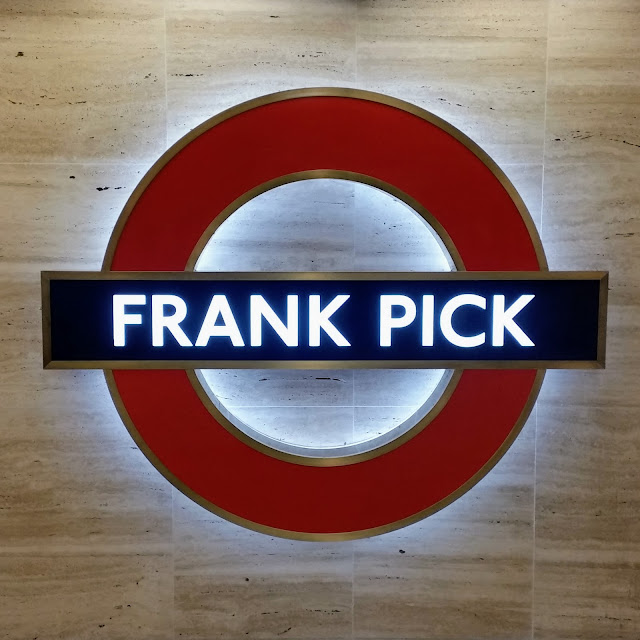
One of the things that is instantly recognisable around the world, is the Roundel: The symbol used by Transport for London on all of their stations, bus stops, promotional material, etc..
Brief History
1908: The Roundel began its life as a red, glassy, enamel disc crossed by a blue bar and was called, simply, the Bar and Circle. It was used to make platform names stand out.
1911-12: As there is no set typeface, or guidelines, the Bar and Circle are used imaginatively by various artists. Also, the letters 'U' and 'D' begin to appear on the logo. Then, in 1912, the London General Omnibus Company becomes part of the Underground Group. Thus begins a way of unifying the two company logos.
1913: Frank Pick, a publicity manager, commissions Edward Johnston, a typographer, to design a typeface for the new company.
1914: The Metropolitan Railway, in an effort to establish their independence, introduce their own version of the Roundel, which consists of a blue bar across a red diamond.
1916-17: With its new typeface the Roundel is registered as a trademark.
1920-33: Several different versions of the Roundel are designed in an effort to unify the symbol for the various parts of the organisation.
1933: A winged logo is chosen, by the newly formed London Passenger Transport Board, but it is short lived. Edward Johnston sets about redesigning the symbol to better reflect the company.
1935: The bus stop Roundel is redesigned by Hans Schleger, who keeps the colours but removes the outline.
 |
| Harrow on the Hill Roundel (without hyphens). |
1938: London Transport establishes guidelines for the precise usage and design of the Roundel, when it issues a 'Standard Signs Manual'.
1947: London Transport is nationalised, but the Roundel stays.
1972: The Roundel is named as the official corporate symbol of London Transport.
 |
| London River Services Roundel. |
.jpg)


No comments:
Post a Comment